October 20, 2026
When choosing colors whether for design or art, knowing the principles will help you create harmony in any color palette.
The color wheel
The color wheel is the visual display of colors arranged in a circle. It is an important tool for using colors that are pleasing together.
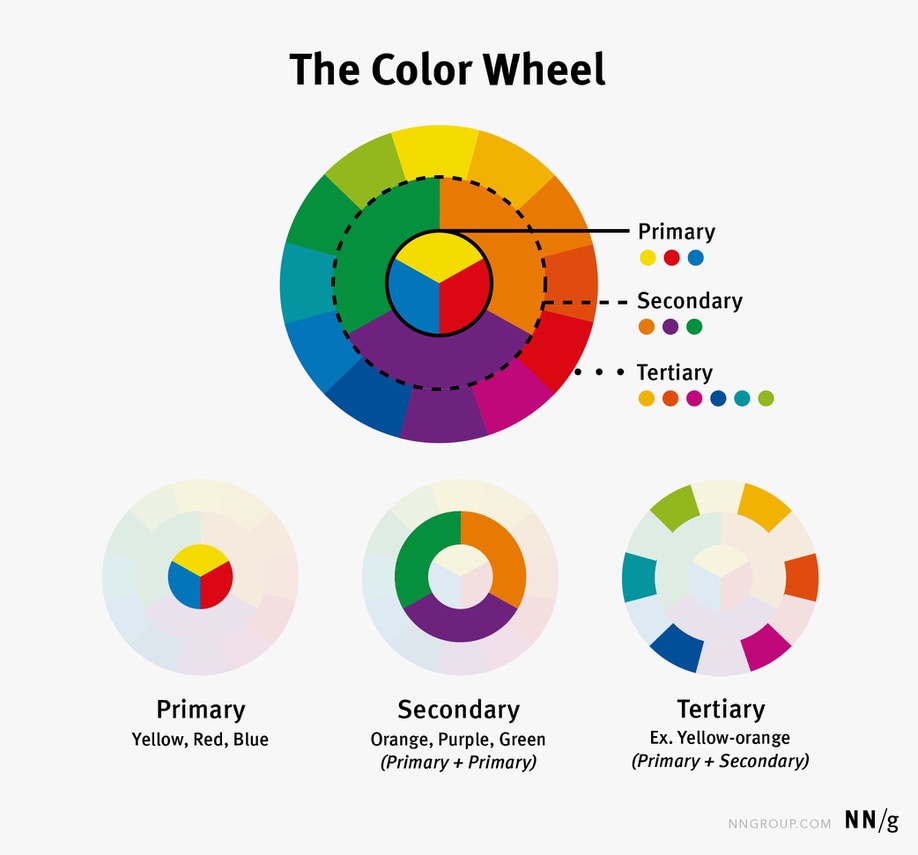
Color Theory
The various ways that colors go together is explained by the term known as Color Theory.
Color Theory in itself is a whole course of learning. Color harmonies is what grouping of colors work well together.
In design
In design, the rule is the 60-30-10 rule. This means using 60% for the main color, 30% for the secondary color and 10% towards an accent color.
Color harmonies
Color harmonies are broken down into five categories:
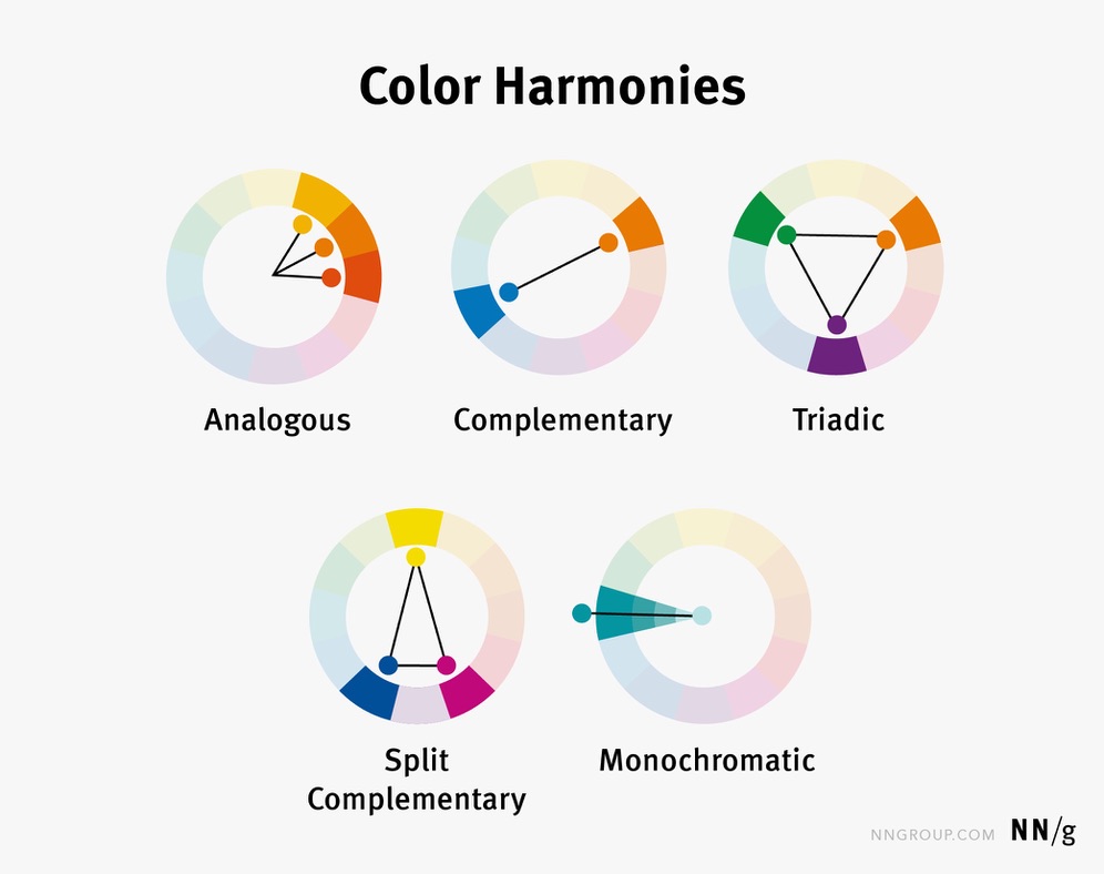
- Analogous– Colors that are next to other on the color wheel. These color harmonies create low color contrast.
- Complementary- Colors that are opposite on the color wheel, which produce high color contrast.
- Split-complimentary- A color combined with other colors from either side of its complementary color. This grouping slightly softens the contrast from basic complementary colors.
- Triadic: Three colors that are 120 degrees apart on the color wheel.
- Monochromatic- Tones and shades of a single color.
What is the theory?
Color theory involves both the science and the art of using color.
The modern color theory was proven by Sir Isaac Newton in 1666. The theory is that white light is not pure or colorless, but instead made up of a spectrum of different wave lengths.
Color theory is used in everything from art, advertising to interior design. Following the color wheel can prevent you from putting two colors together that don’t go well alongside one another.
Clashing colors
Besides knowing what colors go well together, it is important to know what colors do not pair up well.
- Red and Green- The colors clash because they are strongly associated with Christmas.
- Brown and Black- Both are very dark, heavy neutrals that can look muddy or lack definition.
- Navy Blue and Black- The shades are so similar that they look like an accidental mismatch.
- Orange and Green- These two compete for attention and can feel overwhelming.
Why learn about color theory?
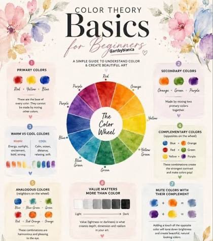
Color theory helps us understand the visual world around us. By understanding the basics of the color wheel, you can empower yourself to create beautiful art, eye popping designs and inviting home harmonies. This is a knowledge that will most certainly add to your creativity and expression.
Want to learn more?
Color theory for beginners https://youtu.be/2QTHs7QSR9o?si=k85XiytzvIhDYJZY
This color wheel palette is a great tool https://www.canva.com/colors/color-wheel/
I hope this will be helpful when working with color schemes.
Kelly